Written by Marion Zielentino
Surrounded by stimuli all day, every day, you have to work hard to grab the attention of your audience. So what is key to standing out and how can a great creative drive results?
Whether it’s a blog post, a brochure, or a website, a clear hierarchy will ensure that your content will connect, engage, and convert and make a lasting impact.
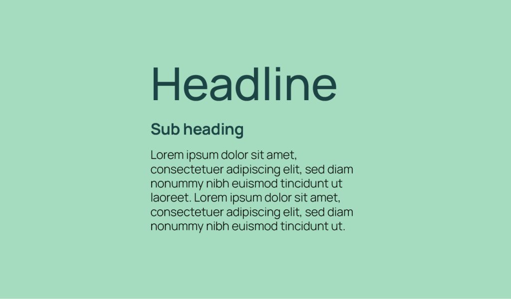
We use visual hierarchy to organise content by applying techniques such as headings, font choices, and line spacing to enhance readability and ensure that the audience can easily follow along. Content can leave the audience feeling overwhelmed or lost, however its the creatives job to make sure that your message is heard loud and proud.
Ways to enhance visual hierarchy
- Size and Scale Increasing the size of the focal point relative to other elements is a fundamental technique we use in creating visual hierarchy. Larger elements naturally draw the viewer’s eye first, making them an excellent tool for highlighting important information.

- Colour and Contrast Using colour and contrast effectively is a powerful way we create focal points in our designs. Bold, vibrant colours for the focal point can immediately draw the viewer’s attention, especially when set against a more neutral or subdued background.

- Placement Placement is a crucial aspect of creating effective visual hierarchy. Positioning the focal point in a prominent location within the design, such as the centre or top, ensures it is immediately noticeable to the viewer.

- Whitespace This one is always marmite, people say they want white space, but find a way to fill it. Whitespace, or negative space, plays a crucial role in creating visual hierarchy. Although having plenty of ‘empty’ space may seem strange, this technique isolates the key elements from the rest of the content. We love white space.

- Typography Typography is a powerful tool for creating visual hierarchy and emphasising focal points. Using different fonts, sizes, or styles lets us draw attention to specific elements within the design.

- Images and Graphics Using compelling images or graphics as focal points is an effective strategy we employ for creating visual hierarchy. Visual elements such as photos or illustrations can capture the viewer’s attention more powerfully than text alone.

How can good design drive results?
Enhanced Brand Identity
Strategically using visual hierarchy can make your brand instantly recognisable and memorable. By carefully considering every element, from the logo to the colour scheme, you can create designs that strengthen your brand identity and leave a lasting impression.
Improved User Engagement
Employing visual hierarchy techniques can help create intuitive and engaging user experiences. By guiding the viewer’s eye to the most important elements, you keep your audience captivated and invested in your content, making your designs more engaging and encouraging deeper interaction with your brand.
Increased Conversion Rates
Strategic design elements are crucial for guiding users towards key actions. By emphasising call-to-action buttons and important information, you can boost conversion rates and drive tangible results for your business. At Sanders and Jay we’ve found that effective designs not only look good but also perform well, turning visitors into loyal customers.
Optimised User Experience
User experience is at the heart of our design philosophy. By prioritising visual hierarchy, you can ensure your website or digital platform is easy to navigate, enhancing user satisfaction and retention.
Stronger Communication
Clear and effective communication is vital for any brand. Using a visual hierarchy approach highlights your key messages, ensuring they are seen and understood by your audience. This makes your communication more impactful and helps convey your brand story with clarity and conviction.
Competitive Advantage
In a crowded market, standing out is essential. Applying visual hierarchy principles can help create unique and compelling designs that set you apart from the competition. Distinctive visuals capture attention and differentiate your brand, giving you a significant competitive edge.
Scalability and Flexibility
Design solutions should be both stunning and adaptable. As your business grows and market trends evolve, your designs should be ready to grow and evolve with you. Flexible solutions that can be adjusted to meet changing needs ensure long-term relevance and effectiveness.
SEO Benefits
Well-designed websites with clear visual hierarchy improve SEO performance. By organising content effectively and enhancing readability, you can help your site rank higher in search results. This attracts more organic traffic, expanding your reach and boosting your online visibility.
Consistency Across Channels
Consistency is key in reinforcing your brand message. Ensuring design consistency across all marketing channels creates a unified and cohesive customer experience. This builds trust and recognition, making your brand more reliable and professional.
Informed Decision-Making
Gaining valuable insights and recommendations helps us to make informed decisions about our design strategies. Aligning designs with your business goals provides a strategic advantage that drives success.
Visual hierarchy is more than just a design principle—it’s the secret sauce that transforms your work from good to unforgettable. At Sanders and Jay, we create designs that speak clearly and powerfully to your audience, delivering strategic benefits that drive your business forward.


