A well-designed badge or logo is no longer just a symbol of identity, it is a powerful marketing tool that can attract new fans, sponsors, and bring significant commercial opportunities. However, change is hard, not always well received, and there will be challenges ahead.
Inspired by Cambridge United’s recent branding transformation, we explore the balance between tradition and innovation in sports team branding and how the process of rebranding a sports team is particularly highly emotive. A rebrand for any business can stir up some deep feelings, but try this with millions of fans across the globe all with a vocal opinion.
According to Dr Lynn Zubernis Ph.D.“Being part of a fandom provides a sense of community and is related to higher social self-esteem and lower levels of loneliness and alienation”. With this in mind, it really comes as no surprise that the fans feel that their club is a part of them and they are a part of it.
It’s a minefield, so proceed with caution.
Some of the most successful badge and logo redesigns in recent years have set new standards in sports branding, from the sleek and modern design of Juventus’ logo to the bold and dynamic crest of Manchester City. These transformations have not only refreshed the teams’ visual identities, but have also significantly boosted their global appeal and commercial desirability. There have also been some notable example of backfiring for example the attempt of Leeds United back in 2018, which was so catastrophically received that 50,000 fans signed a petition for the plug to be pulled on the project within 24 hours of the suggested design being released!
A noticeable trend in sports badge design and logo design as a whole, is a move towards simplification, however the challenge lies in modernisation without without losing the brand’s identity, affinity or its heritage. Simplification can make a logo more versatile and easier to reproduce across various platforms, but it’s crucial to retain the elements that fans associate with their team’s history and spirit. Balancing these aspects ensures that the rebrand resonates with both new audiences and lifelong supporters. You’ll have to look closely at the New Feyenord logo… the evolution is a little less obvious.
Before
After
Before

After
Before

After
Before
After
Before
After
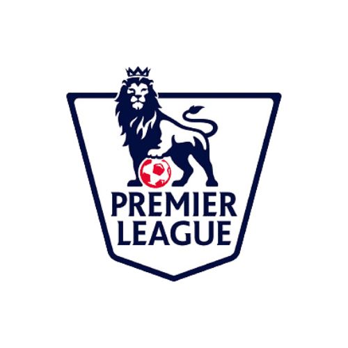
Before
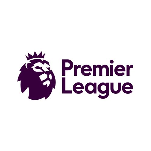
After
As passionate supporters of Cambridge United, our creative team at Sanders and Jay were particularly inspired by the club’s recent branding transformation. The process was a poignant reminder of how deeply fans are connected to their club’s identity and business owners have to be careful that their strategic direction includes the fans and brings them on the journey.
Despite the existing Cambridge badge being a simplistic retro design, the current design is cherished by many as it represents the club’s history and their personal connection to the club. The fans all want to see the club move forward and glory days restored, but they sought this with evolution, not revolution. They desired a badge that honours the past while embracing the future. This was something that Cambridge United were very passionate about throughout the process assessing their history and heritage, but perhaps in the first round of designs landed at more ‘revolution’. “DON’T MESS WITH OUR BADGE”, “DON’T CHANGE” echoed though the chat rooms and social media platforms.
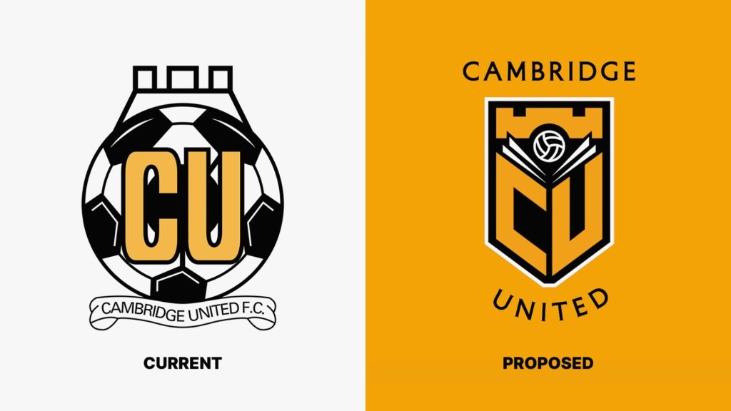
Throughout its history, the Cambridge United logo has undergone various iterations, yet, the current logo is the one that resonates most strongly with today’s supporters, many of whom have grown up with it and only the elder generation would be familiar with its original look and feel. Following the initial resistance, from the fans, the club re-looked at their approach and provided the fans with another three iterations, addressing and articulating the routes of changes with a clear explanation to how they got there. The presentations were well thought out and provided a clear vision for the future, but there are still grumblings in the club and socials that they have lost the identity across all options, and it doesn’t truly reflect their identity and may still be a step too far across the evolution – revolution spectrum?
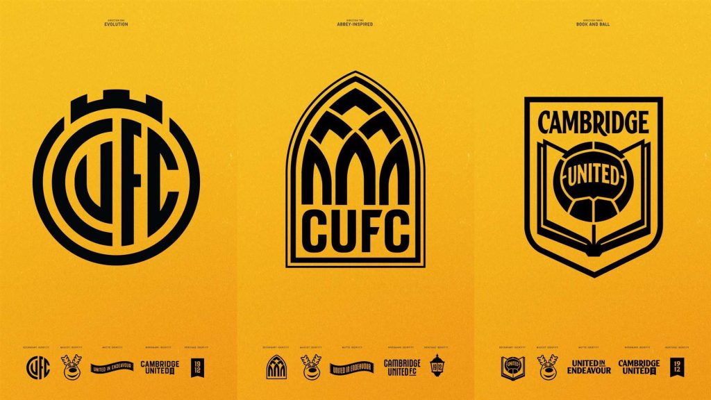
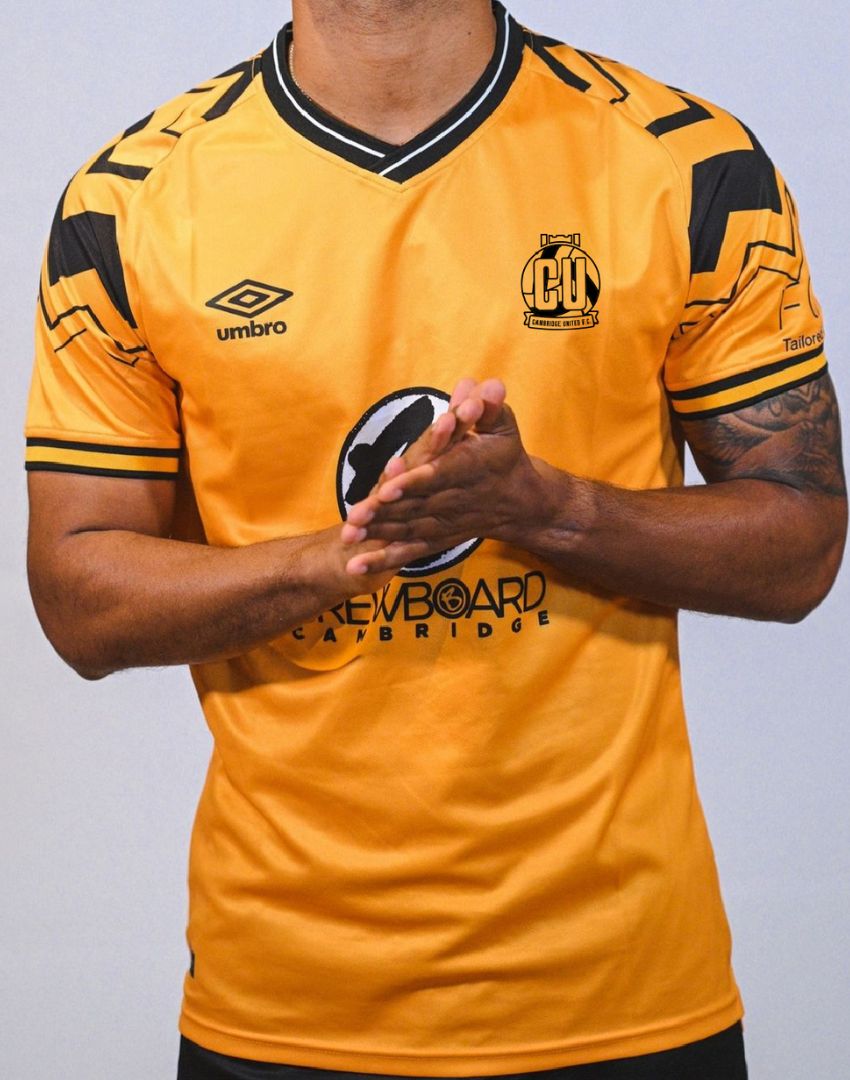
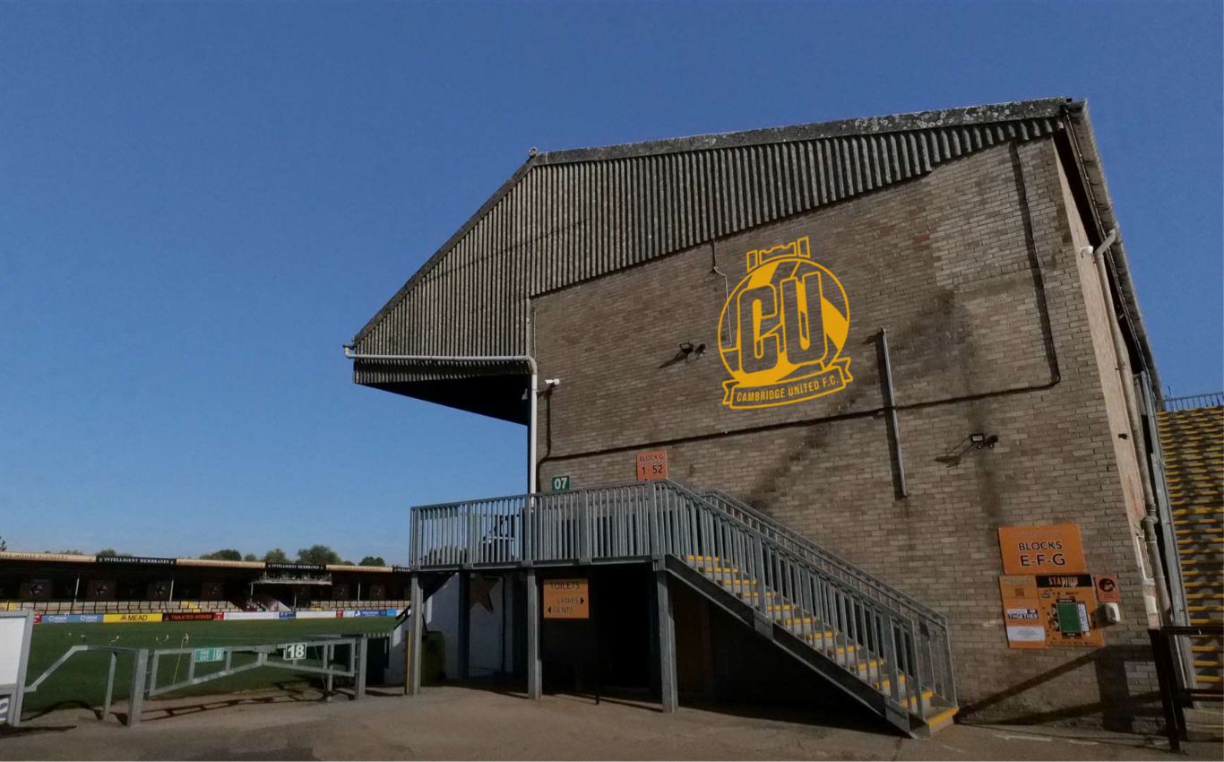
Without the full brief, but fuelled with fans, we asked our design team what they’d do to evolve the existing logo, whilst maintaining the history and heritage.
Here is what we came up with;

