Written by Josh Murphy and Marion Zielentino
Despite the Olympic Games’ 3,000 years of History, the first official Olympic logo didn’t pop up until the Paris Games in 1924. Before that, it was a bit of a free-for-all with various emblems and posters.
So why is the host Olympic logo so important? Well, they do a lot more than look good on merch.
The logo is the face of the games and sets each game apart from the others. It symbolises the host’s culture and character while symbolising the Olympic spirit, ‘bringing people together from all over the world’.
The challenge is to keep the logo mark fresh, modern, culturally sensitive, impactful, versatile, simple, clean, and timeless—one that makes your heart swell. This is no easy task, and from a quick glance at the last 100 years, some are great, and some have left a little to be desired.
We got together with the team to discuss our top 5 Olympic logos of all time.
- Mexico City 1968
In the top spot, we are going with Mexico 1968. The design represents the track in simple black lines and blends the year cleverly into the logo. The font is retro yet timeless and blends traditional Mexican aesthetics and contemporary design trends, creating a visual identity that is both modern and deeply rooted in local culture. We’re a big fan!
2. Atalanta 1996
Second up is Atlanta 1996. The font and spacing of the 100 represent Greek columns as well as marking the grand anniversary of the games. The design is simple and shows the evolution of Olympians from flame to stars. We like the thoughtful combination of elements and think it creates a strong and memorable emblem for the Atlanta Olympics.
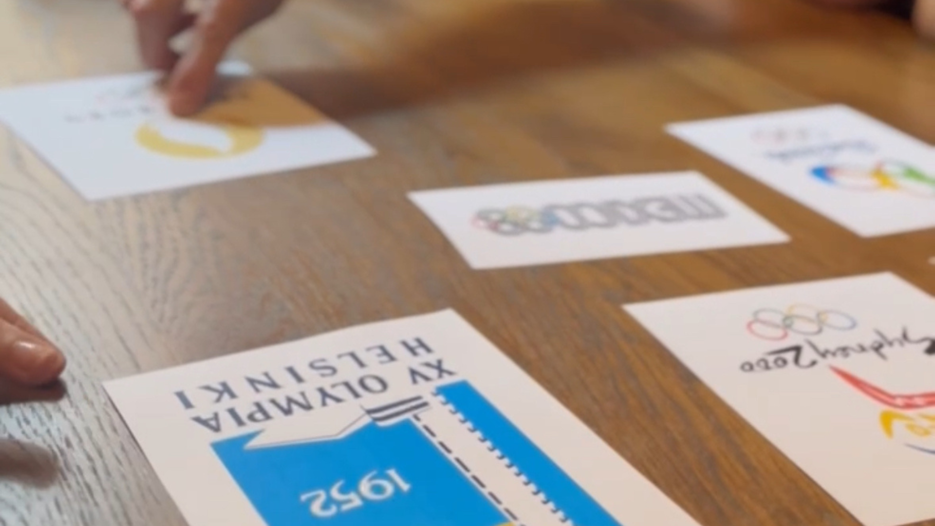
3. Helsinki 1952
Third on the podium with bronze is Helsinki 1952. This one is definitely a beaut for the merch! We love the clean lines and more traditional font. The simple colour choice represents Finland’s national colours and adds to the crispness of the design. This combination of national symbolism and Olympic tradition creates a logo that is not only visually appealing but also rich in meaning.
4. Paris 2024
Just missing the medals is Paris 2024. The logo cleverly combines three symbols; the gold medal, the flame and Marianne, who is the personification of the French Republic. The colours are clean and the design is elegant. And, for the first time in history the Olympic and Paralympic Games are using the same emblem. It’s great to see more inclusive changes blazing the trail.
5. Sydney 2000
Just making the top 5 is Sydney 2000 with their clever logo. They incorporated not one, but three boomerangs as well as the Sydney Opera House coming from the Olympic torch. The colours are simple and create a retro feel to the design. If only they’d included a kangaroo too…
London just missed out on the top 5 Olympic Logos following resistance from our Head of Design Steve. The logo was criticised for its messy and difficult-to-read font. We tend to prefer simple and more elegant designs that stand the test of time.
The future looks even brighter with the Olympic Logo icon as we look forward to LA 2028.
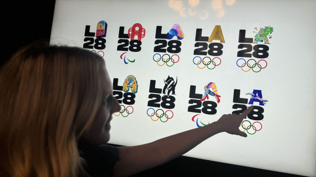
We are big fans of the adaptable logo for the LA 2028 Olympic and Paralympic Games. LA has revealed a chunky, bold logotype wherein the ‘A’ of LA is adaptable, and has – so far – 32 different iterations by various creators. The design team enlisted top athletes, actors, artists, and pop stars alike to convey what the city means to them via their letterform, producing a vast range of aesthetically eclectic logos by huge names such as Alex Israel, Steven Harrington, Billie Eilish, Reese Witherspoon, Michael Johnson, Chloe Kim, Simone Manuel, and Ezra Frech. They come together with the tagline “every ‘A’ tells a story”, and there is a film accompanying each logo design, interviewing the designer about their interpretation of the brief. Read more here: www.la28.org/en/newsroom/la28-reveals-new-emblem-designs-from-olympians.html
Olympic logos are way more than just pretty pictures—they’re powerful symbols that unite and inspire. From Tokyo’s elegant simplicity to London’s bold statement, each logo tells a story. It’s not always easy to tell your story, and sometimes, we need an outsider’s point of view to steer us away from what’s comfortable. At Sanders and Jay, we’re here to help you create branding that stands the test of time.
Ready to tell your story? Let’s go!