
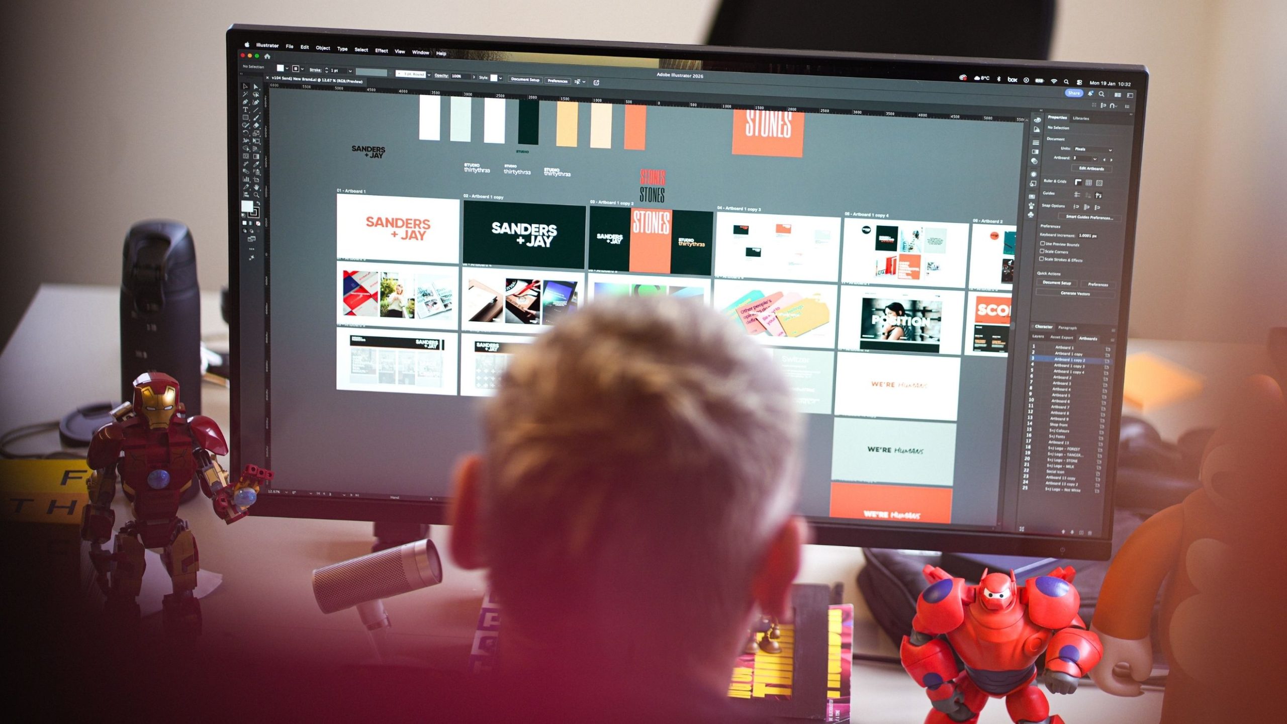
Some of you may have already noticed that our logo has changed… and you’d be correct in your thinking, we have rebranded, and this time not just a tweak, or update, or adding some new colours, we’ve gone back to the drawing board and created a whole new look, but with all the same values, just a clearer, more confident expression of who we are.
Sometimes you just know when the time is right. And the time simply felt right. Our brand has been a symbol of our business since its inception back in 2018. It has stood the test of time and represented the positive change in which it set out to make, most notably represented by the 33 pluses above the name, which also happens to be a Murphy lucky number.
With that in the back of our minds, the timing had to feel right and not just be for the sake of a new look or following a current trend. Your brand should always look and feel like you, it should always represent the people behind it not just the product or service it offers.
As we embark on a new year, the year of the fire horse to be precise, which is a year for action, progress, and breaking through obstacles, encouraging people to trust their instincts, embrace change, and pursue dreams with confidence. What better time to trust our own instincts and launch a new look for our agency.
Our new brand needed to have that same sense of positive energy, but also showcase our growth, confidence and creativity, reflect who we are now. So that’s what we have done.
You may think that we have found it easy as it’s what we do day in day out, but believe me when I say this, we haven’t. As with many of our clients updating a brand with a history and personal connection is tricky. Every decision matters and can feel tough and sometimes even emotional. So, as with our clients, we took our time and asked all the right questions along the way.
One of the hardest parts was choosing new colours. We’ve been a teal brand, or variations of, for a long time now so moving away from this was never going to be simple. At first an evolution looked to be the way forward, but this felt too familiar, safe and maybe a bit polite. We wanted something more confident, forward thinking and considered. If we kept the colours too close to where we’ve been, the rebrand then becomes cosmetic rather than meaningful.
So we tried revolution, bold, zingy colourways paired with soft neutrals, but this also didn’t sit right with us. At one point a simple black and white was on the table (easy to print at least) but as clean as this looked and for many design agencies across the world, one that works for them. We still felt it wasn’t truly reflective of us.
After a few more (many more) discussions, working sessions, looking around and at some points just trying the most random combinations simply to rule them out we settled on, you guessed it, teal. Only joking, it’s green.
Forest Green to be exact. So not a million miles away from where we where but deeper, richer and purposeful than our previous colours. Pair that with a not white white and we had a look that we all loved, that felt right and reflected our confidence. That’s not the end of it as we also wanted a few colours to match our softer side, our fun side and our creativity (as that is what we do) so burst of tangerine every now and then a peach and a yellow used sparingly rounded it all off. We got there in the end and the results feel exactly what we wanted.
The rest was easy after that, a nice bold modern typeface, Gilroy, which has actually now been around for 10 years, but still looks as clean today as when it launched. A small update for Manrope to Switzer for the main body text and for when we want a little personal touch we’ve got a handwritten font we can use.
So, as we said it wasn’t easy by any means but we are proud to showcase our new look to the world. Same care, same thinking, just a little more clarity. If you like it, please do let us know, if you don’t that’s also ok, we won’t take it personally, design can be very subjective and not everyone will feel the same, but what’s important is it represents us.
We’d love the opportunity to take you on a similar journey all be it one that is your own. We will guide and support you every step of the way, because we care about the people behind the brands, not just the project itself, that’s why our work works. So if you’re wondering what’s next for your brand, we’d love to help. Let’s make 2026 one to remember.